CanvasXpress vs. Plotly
A factual, feature-by-feature comparison for interactive, reproducible data visualization. The same dataset, side by side.
CanvasXpress and Plotly are both libraries for interactive data visualization with R, Python, Julia and JavaScript APIs. The core difference: CanvasXpress renders 60+ chart types from a single grammar-of-graphics engine and one portable JSON specification, and ships a no-code interactive UI, a reproducible audit trail and a Model Context Protocol (MCP) server for AI agents — all built in. Plotly is a broadly adopted, general-purpose charting library popular for business dashboards (especially via Dash), with a large community and polished defaults. Choose CanvasXpress when reproducibility, scientific/bioinformatics chart types, an out-of-the-box exploration UI, or AI-agent-generated figures matter most. Choose Plotly when you want a large ecosystem, a Dash-based app framework, or a widely taught general-purpose API. For rendering performance, see the benchmarks — measured against Plotly's SVG and WebGL renderers — or run them live.
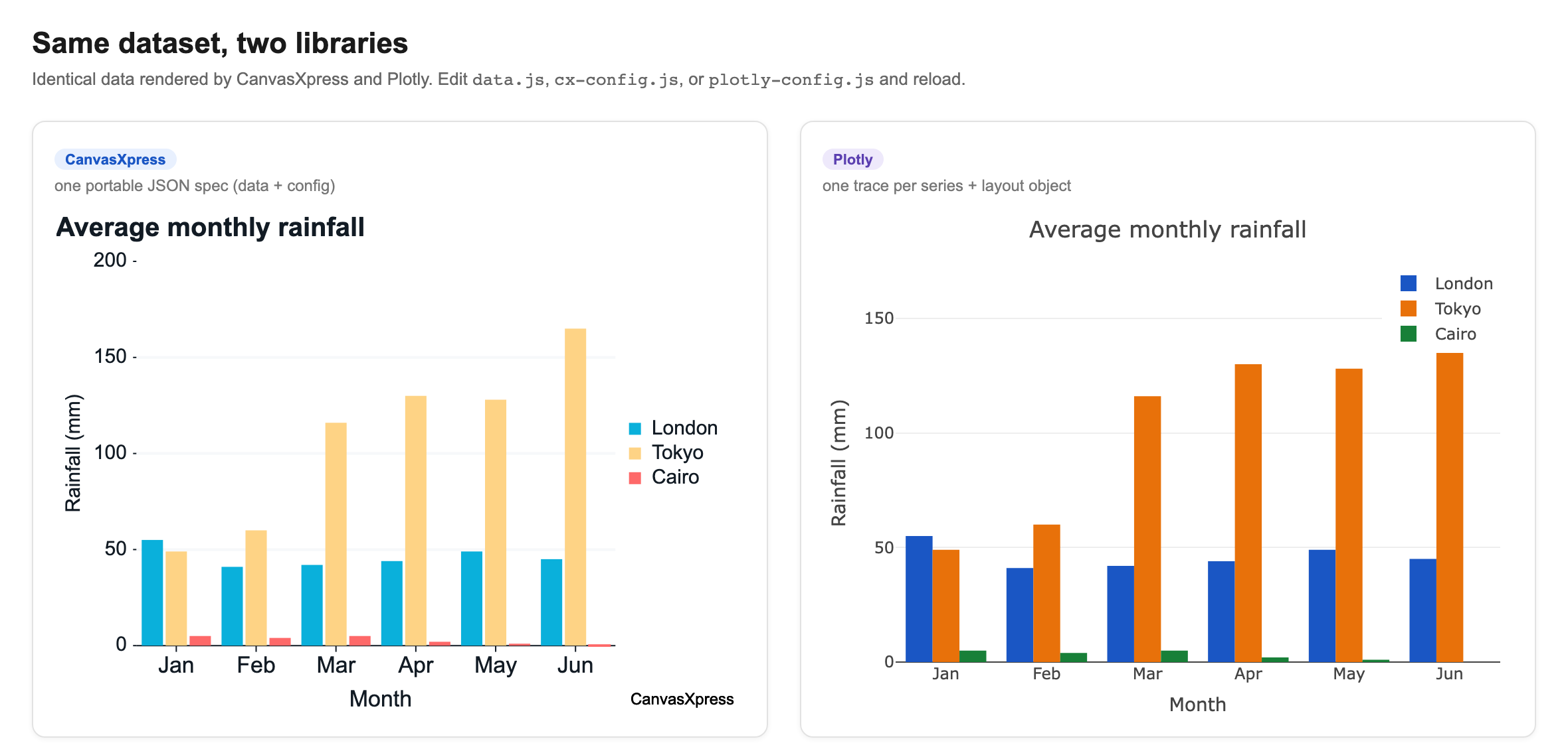
The same dataset, two libraries
The same data rendered by both libraries — identical values, each library's native output.
At-a-glance comparison
| Dimension | CanvasXpress | Plotly |
|---|---|---|
| License | Source-available; free anywhere including commercial as long as the attribution mark stays visible; commercial license removes the mark | Open source (MIT); some tooling (Dash Enterprise) commercial |
| Core model | Single grammar-of-graphics engine; one portable JSON spec (meta.cxplot) | Figure/trace JSON model (plotly.js schema) |
| Language APIs | R, Python, Julia, JavaScript, React, cxplot fluent builder — all share one engine | Python, R, JavaScript, Julia, MATLAB, F# |
| No-code interactive UI | Built in: zoom, filter, sort, transform, facet, broadcast, shelf-style field mapping, calculated fields, binning, aggregation | Modebar (zoom/pan/select) built in; richer no-code editing needs Dash/Chart Studio |
| Reproducibility | Reproducible audit trail — every committed action (data, config, filter, sort, transform, clustering) is a replayable grammar operation with undo/redo | Not built in; reproducibility is code-side |
| AI / agents | Built-in AI copilot + canvasxpress-mcp MCP server so agents build/edit figures | No first-party MCP server; used via general code generation |
| Scientific / bioinformatics charts | First-class (heatmaps, genome browsers, complex/annotated heatmaps, network, dendrograms) | General-purpose with native heatmaps, contours and parallel coordinates; genomics via Dash Bio; clustering/dendrograms via a separate figure-factory helper |
| Cross-chart linking | Built-in broadcast groups (filter/select propagates across charts) | Via Dash callbacks |
| Dashboards | canvasxpress-dashboards no-code builder + portable spec, pluggable storage (file/S3/Postgres/Google Drive) | Dash (Python app framework) |
| Authenticated data | canvasxpress-connectors charts SQL/Google Sheets without exposing credentials to the browser | App-side data handling |
| Accessibility | WCAG 2.1 role="img" + generated aria-label, off-screen data table, keyboard navigation between data points, live announcements, reduced motion, high-contrast theme; published VPAT 2.5 | ARIA support varies by trace/config |
| Rendering | HTML5 Canvas | SVG + WebGL |
| Best fit | Scientific research, bioinformatics, reproducible analysis, AI-agent workflows | Business dashboards, general analytics, Dash apps, large community |
What each library is
CanvasXpress is a source-available JavaScript library for interactive, reproducible scientific data visualization. A single grammar-of-graphics engine — data → aesthetics → layers (geom × stat × position) → scales → coord → facet — renders 60+ chart types from one portable JSON specification. It offers R, Python, Julia and JavaScript APIs over the same engine, a no-code exploration UI, a replayable audit trail, and an MCP server for AI agents.
Plotly is an open-source graphing library for interactive charts with APIs in Python, R, JavaScript, Julia and MATLAB. It is widely adopted for general analytics and business dashboards, has a large community, polished defaults, and pairs with Dash, Plotly's Python framework for building analytical web applications.
Feature deep-dives
Grammar of graphics and portability
CanvasXpress describes a figure once as a normalized JSON spec (meta.cxplot) that the same engine renders across R, Python, Julia and JavaScript, so a chart authored in one language is portable to another. Plotly's figure is a traces-and-layout JSON object shared across its language bindings; both are declarative, but CanvasXpress centers a single grammar-of-graphics abstraction rather than a per-trace model.
Built-in interactivity and no-code exploration
CanvasXpress ships end-user interactivity — zoom, filter, sort, transform, facet, broadcast, shelf-style field mapping, calculated fields, binning and aggregation — without additional code or a separate app layer. Plotly provides interactive zoom/pan/hover/select out of the box; deeper no-code data manipulation typically comes through Dash or Chart Studio.
Reproducibility and audit trail
In CanvasXpress every committed action (data, config, filters, sorting, transforms, clustering) is recorded as a replayable grammar operation with undo/redo, producing a reproducible audit trail suited to scientific and regulated workflows. Plotly does not include a built-in interaction audit trail; reproducibility is handled in the surrounding application code.
AI agents and the Model Context Protocol (MCP)
CanvasXpress provides a built-in AI copilot and a first-party MCP server (canvasxpress-mcp) so AI agents can build and edit figures directly from natural language. Plotly has no first-party MCP server; agents generate Plotly code the way they generate any library code.
Scientific and bioinformatics charts
CanvasXpress treats scientific chart types — heatmaps, complex/annotated heatmaps, genome browsers, networks, dendrograms — as first-class citizens of the engine. Plotly covers a broad general-purpose chart set and offers native heatmaps, contours and parallel coordinates; genomics charts come from Dash Bio, and clustered heatmaps with dendrograms from a separate figure-factory helper rather than the chart itself.
Dashboards and cross-chart linking
CanvasXpress links charts natively through broadcast groups (a filter or selection on one chart propagates to connected charts) and adds canvasxpress-dashboards, a no-code builder with a portable spec and pluggable storage (file, S3, Postgres, Google Drive). Plotly composes multi-chart apps through Dash, a full Python web-app framework with callback-based interactivity.
Accessibility
Every CanvasXpress canvas carries a screen-reader alternative — WCAG 2.1 role="img" plus a generated aria-label describing chart type, titles, axes, series/sample counts and value range — that regenerates whenever the chart updates, plus an off-screen data table, keyboard navigation between data points, live announcements and reduced motion (see accessibility). Plotly's ARIA/accessibility support varies by chart type and configuration.
Where Plotly is the stronger choice
An honest comparison names the places the other library wins — and Plotly wins several:
- Community and ecosystem. Plotly has a far larger user base, many more Stack Overflow answers, tutorials, and third-party examples. If you value being able to search your way out of any problem, Plotly is ahead.
- 3D surfaces and WebGL. Plotly has 3D surfaces and meshes, which CanvasXpress lacks (it has rotatable 3D scatter and 3D networks), and WebGL traces; CanvasXpress renders with Canvas 2D.
- Dash application framework. For building full multi-page analytical web apps in Python, Dash is a complete, well-documented framework; CanvasXpress's dashboards target no-code composition rather than app development.
- Breadth of general-purpose chart polish. Plotly's defaults and export options across common business chart types are highly refined and widely validated.
- Language reach. CanvasXpress ships R, Python, Julia (CanvasXpress.jl) and JavaScript/React APIs over one engine; Plotly additionally offers an official MATLAB binding.
CanvasXpress's advantage is narrower and deeper: a single grammar-of-graphics engine, no-code scientific exploration, a replayable reproducibility trail, first-class bioinformatics chart types, and a first-party MCP server. Where those dominate, it is the better fit; where breadth, community, 3D/WebGL, or a Python app framework dominate, Plotly is.
When to choose each
Choose CanvasXpress for scientific research, bioinformatics, reproducible analysis, out-of-the-box interactive exploration, or AI-agent-generated figures. Choose Plotly for a large general-purpose ecosystem, Dash-based analytical web apps, or a widely taught API with broad community support. The two are not mutually exclusive — CanvasXpress specializes where reproducibility and scientific interactivity dominate.
Frequently asked questions
Is CanvasXpress an alternative to Plotly?
Yes. Both are interactive visualization libraries with R, Python, Julia and JavaScript APIs. CanvasXpress adds a single grammar-of-graphics engine, a no-code exploration UI, a reproducible audit trail, and a built-in MCP server for AI agents.
Is CanvasXpress free to use?
Yes. CanvasXpress is source-available and free to use anywhere, including commercial products, as long as the attribution mark it renders stays visible; a commercial license removes the mark — see the license.
Does CanvasXpress work with R and Python like Plotly?
Yes. CanvasXpress has first-class R (CRAN), Python (PyPI), JavaScript (npm) and React interfaces that all share the same engine and grammar.
Which is better for scientific and bioinformatics visualization?
CanvasXpress is purpose-built for scientific and bioinformatics work, with first-class heatmaps, genome browsers, networks and reproducible interaction tracking. Plotly is general-purpose; it has native heatmaps and reaches genomics through Dash Bio.
Can AI agents generate CanvasXpress charts?
Yes. CanvasXpress ships a Model Context Protocol server (canvasxpress-mcp) and an AI copilot so agents build and edit figures from natural language. Plotly has no first-party MCP server.
When is Plotly the better choice?
When you want a large community ecosystem, the Dash app framework, or a widely taught general-purpose API for business dashboards and generic analytics.
Try it
Every example on this site runs live in the browser. Read the quick start, explore the examples gallery, review the R and Python interfaces, or see the full library comparisons. For dashboards, read the long-form CanvasXpress vs. Plotly Dash.
