
CanvasXpress
An advanced JavaScript library for interactive data visualization, meticulously crafted for scientific and biomedical research.
About CanvasXpress
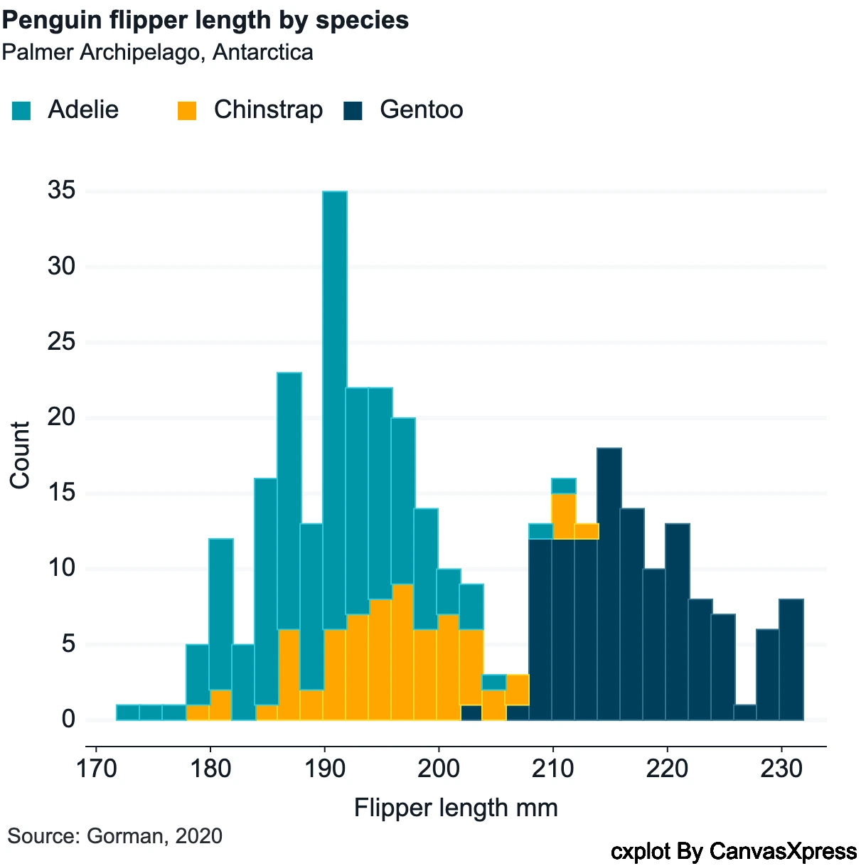
CanvasXpress is a powerful, open-source JavaScript library that enables the creation of high-performance, interactive data visualizations directly in your web browser. Built on HTML5 Canvas, it's engineered to handle the scale and complexity of modern scientific datasets, making it an indispensable tool for researchers, data scientists, and developers in fields like genomics, proteomics, clinical trials, and systems biology. Its comprehensive feature set and robust architecture ensure that complex data can be explored, analyzed, and presented with clarity and precision.
What is CanvasXpress?
- Definition
-
CanvasXpress is an open-source JavaScript library that leverages HTML5 Canvas technology to create interactive, high-performance data visualizations specifically designed for scientific and biomedical research applications.
- Core Purpose
-
The primary purpose of CanvasXpress is to enable researchers, data scientists, and developers to visualize, explore, and analyze complex scientific datasets through intuitive, interactive graphical representations.
- Key Differentiators
-
- • Specialized focus on scientific and biomedical data visualization needs
- • Built-in support for large-scale datasets common in genomics and proteomics
- • Comprehensive set of visualization types specifically for scientific research
- • Seamless integration with popular scientific programming languages (R, Python)
- • Advanced interactive features for data exploration without custom coding
Key Features & Capabilities
Comprehensive Graph Types
Access a vast array of visualization options to suit any data story:
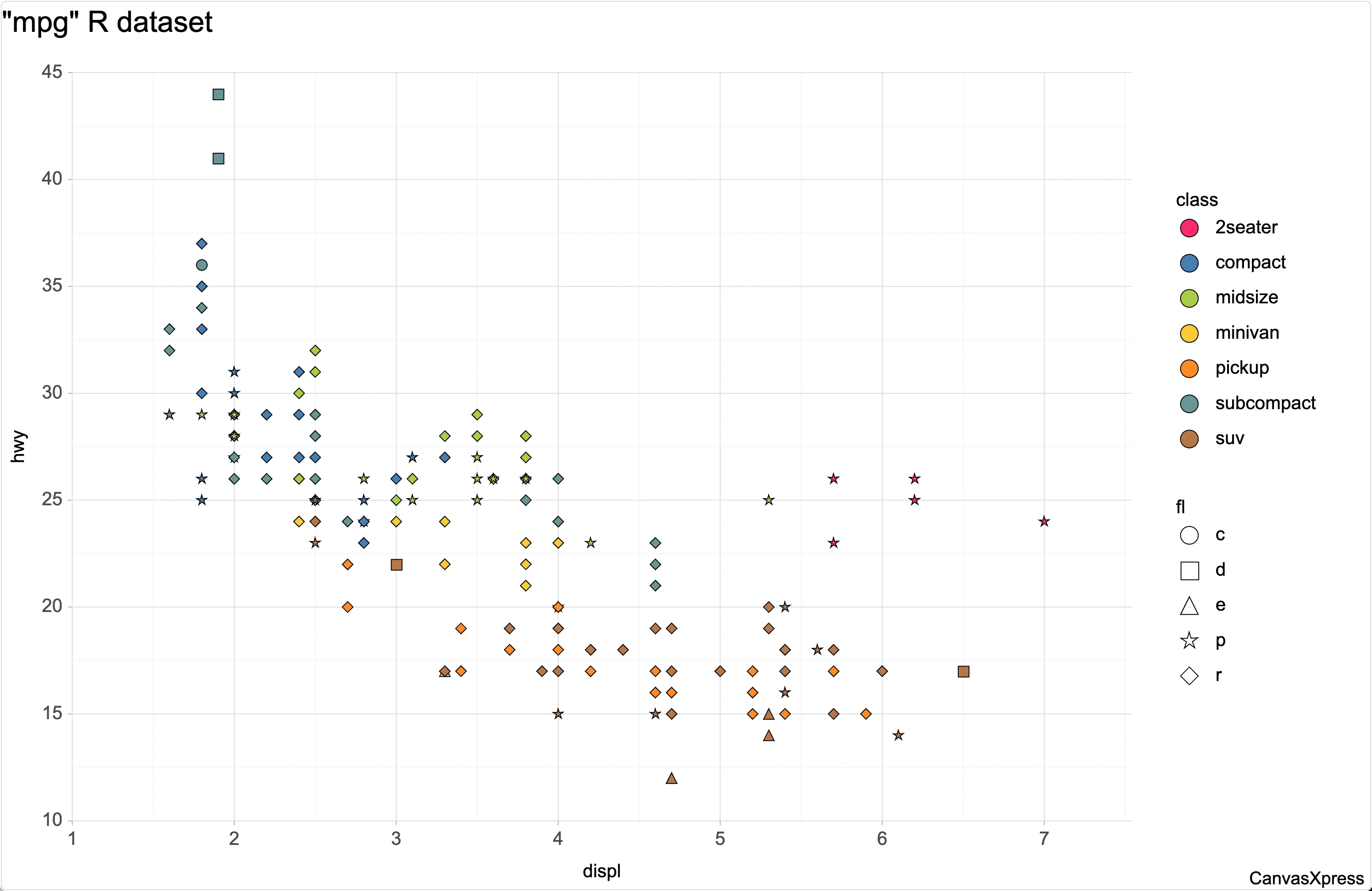
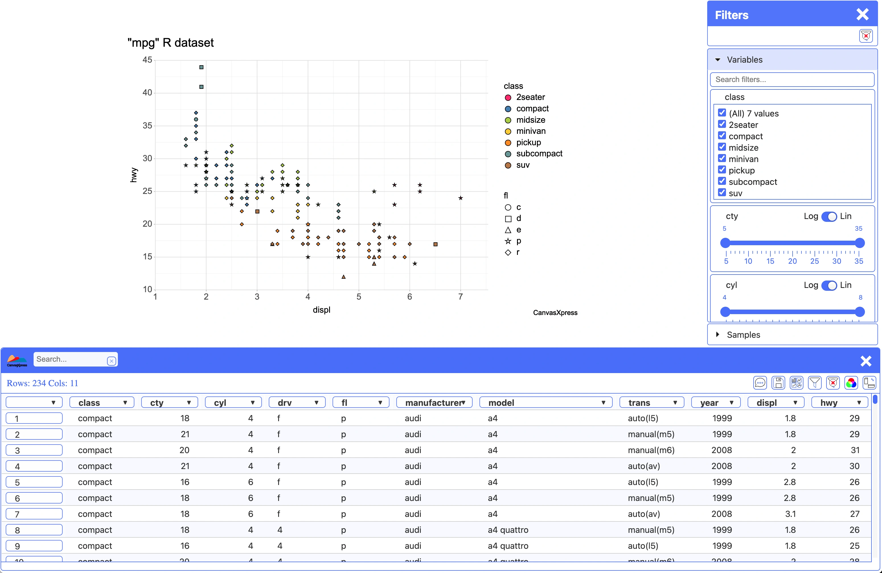
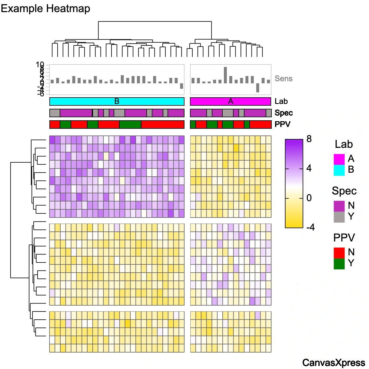
- • Over 40 built-in graph types including Bar, Line, Scatter2D/3D, Heatmap, Boxplot, Violin, Sankey, and more.
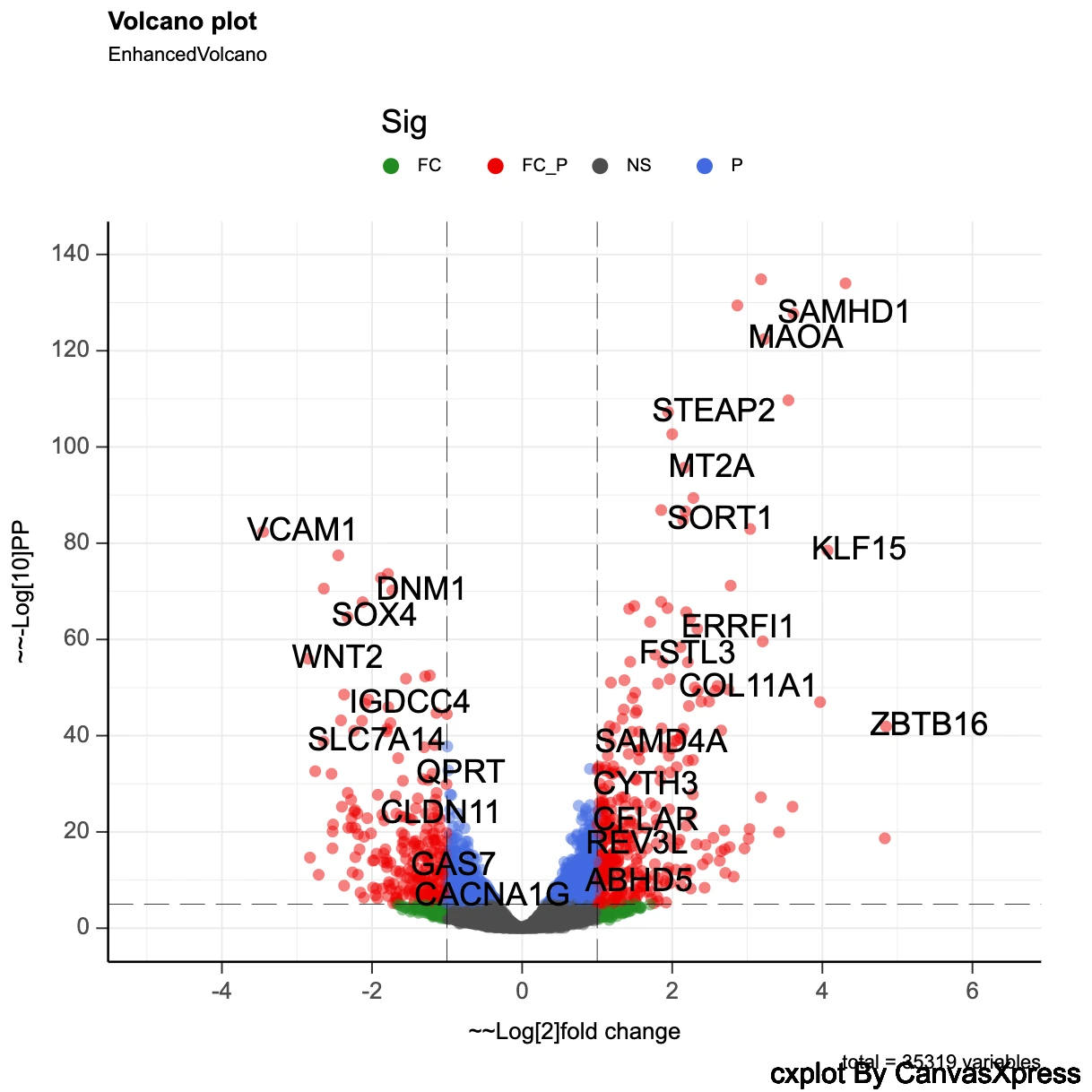
- • Specialized scientific plots like Dendrograms, Volcano plots, and Kaplan-Meier curves.
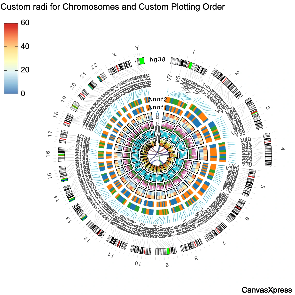
- • Support for one-dimensional, multi-dimensional, and combined graph types.
Rich Interactivity & Exploration
Empower users to deeply explore data with intuitive controls:
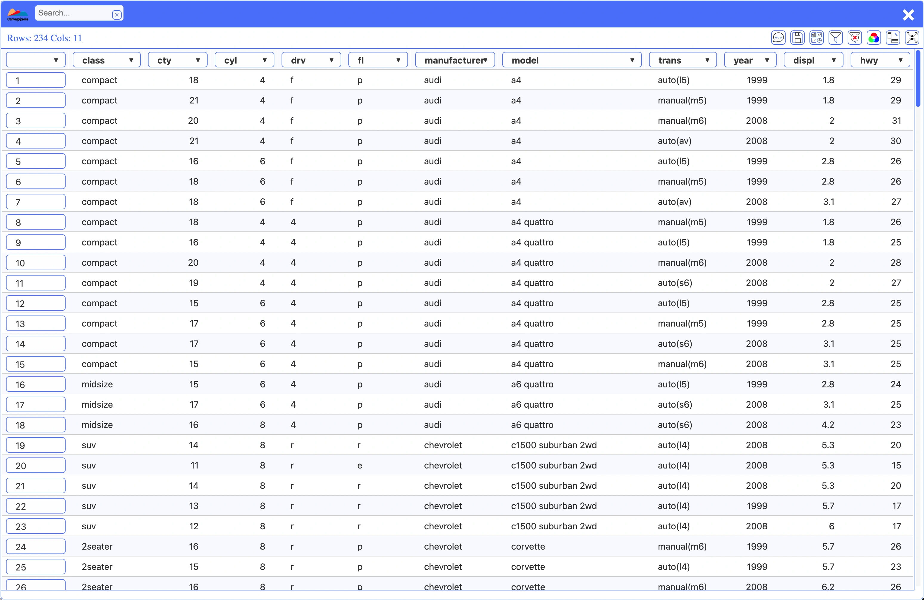
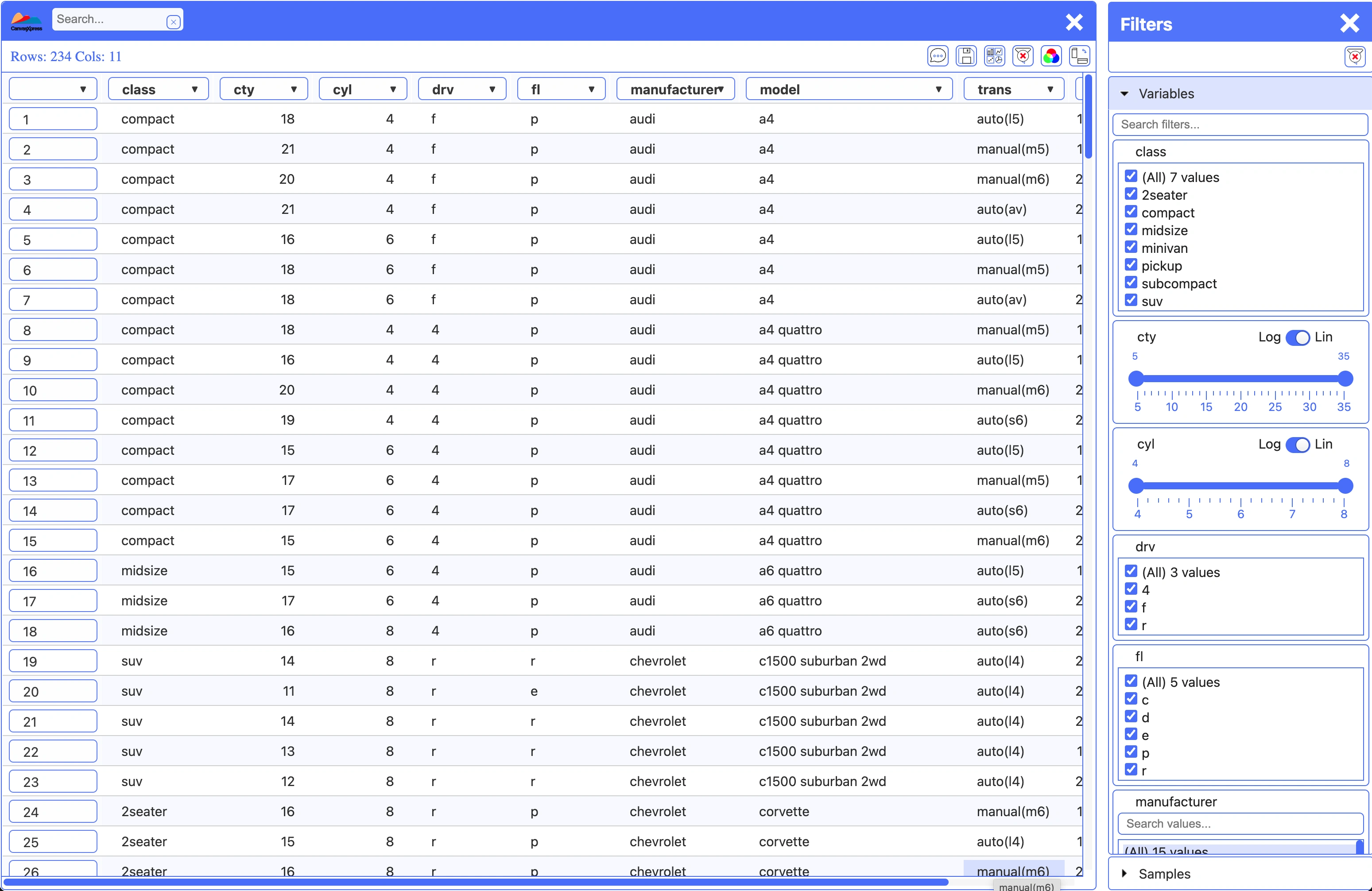
- • Built-in zooming, panning, filtering, and data point selection.
- • Cross-talk and broadcasting capabilities for linked plots.
- • Dynamic data transformation (log2, z-score, percentile) and data sorting.
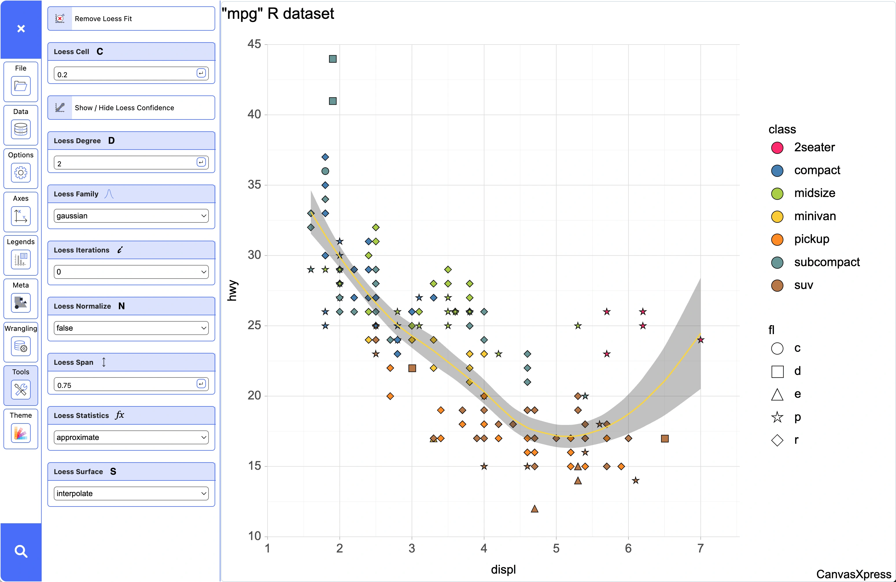
- • Interactive decorations and regression fits (linear, loess, quantile).
Scientific & Reproducible Research Focus
Designed from the ground up for the demands of scientific data:
- • Optimized for large-scale and complex scientific datasets.
- • Automatic audit trail for all data manipulations and plot configurations, ensuring reproducibility.
- • Features for clustering (samples, variables) and data faceting (segregate by).
Applications & Use Cases
CanvasXpress is the visualization solution of choice for domains requiring high-fidelity, interactive data exploration and presentation.
Genomics & Proteomics
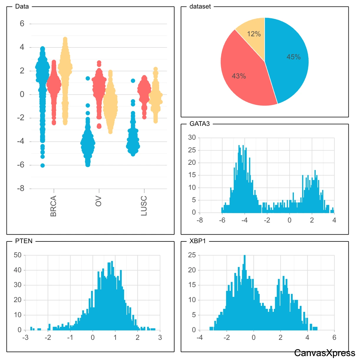
Visualize gene expression, protein abundance, mutation profiles, and multi-omics data with specialized plots like heatmaps, volcano plots, and correlation matrices.
Clinical & Pharmaceutical Research
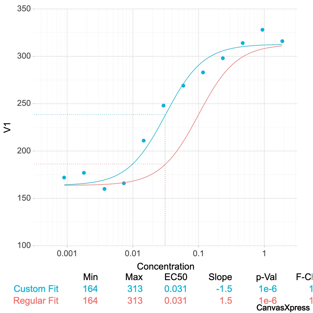
Track patient outcomes, analyze drug responses, and present trial data with clear, interactive charts for survival analysis, dose-response curves, and more.
General Scientific Data Analysis
From physics to environmental science, CanvasXpress provides robust tools for exploratory data analysis, hypothesis testing, and publication-ready visualizations.
Framework Integrations
CanvasXpress is designed to fit effortlessly into your existing data science and web development workflows.
R & Shiny Integration
Leverage the dedicated canvasxpress R package from CRAN or Github to create interactive plots directly from
your R scripts and embed them seamlessly into Shiny web
applications.
Key Features:
- Direct integration with R data frames and matrices
- Reactive bindings for Shiny applications
- Support for R statistical functions
- Customizable through R function parameters
- Convert ggplot2 figures into CanvasXpress interactive plots
# R code example
library(canvasXpress)
data <- data.frame(
  x = c(1, 2, 3, 4, 5),
  y = c(2, 4, 6, 8, 10)
)
canvasXpress(
  data = data,
  graphType = "Scatter2D",
  title = "Simple Scatter Plot"
)

## Alternative using ggplot2
library(ggplot2)
p <- ggplot(data, aes(x = x, y = y)) +
  geom_point() +
  labs(title = "Simple Scatter Plot")
canvasXpress(p)
Python & Jupyter Integration
Generate dynamic CanvasXpress visualizations within your Python scripts, Jupyter notebooks, and other Python-based data analysis environments.
Key Features:
- Native support for pandas DataFrames and NumPy arrays
- Interactive widgets in Jupyter notebooks
- Integration with Python data science ecosystem
- Export capabilities to various formats
# Python code example
import canvasxpress as cx
import pandas as pd

df = pd.DataFrame({
    'x': [1, 2, 3, 4, 5],
    'y': [2, 4, 6, 8, 10]
})

chart = cx.CanvasXpress(
    data=df,
    graph_type="Scatter2D",
    title="Simple Scatter Plot"
)
chart
JavaScript Framework Integration
Integrate CanvasXpress directly into any modern web application using vanilla JavaScript or frameworks like React, Vue or Angular.
Key Features:
- Component-based integration for modern frameworks
- Event handling and two-way data binding
- Customizable through props/attributes
- Support for dynamic data updates
// React component example
import CanvasXpress from 'canvasxpress-react';

function ScatterPlot() {
  const data = [
    ['Id', 'Sample1', 'Sample2'],
    ['A', 1, 2],
    ['B', 3, 4],
    ['C', 5, 6]
  ];

  return (
    <CanvasXpress
      data={data}
      graphType="Scatter2D"
      title="Sample Plot"
    />
  );
}
AI & LLM Integration
Leverage the power of generative AI to create visualizations effortlessly. Access these capabilities directly from any existing CanvasXpress visualization or by simply dragging and dropping a tab-delimited file onto a chart. Use simple text prompts to generate new plots or get instant explanations for any parameter.
Generate Visualizations with Natural Language
Problem: Creating complex scientific visualizations requires deep knowledge of parameters and options.
Solution: Simply describe what you want to see in natural language.
Example prompt: "Create a heatmap showing gene expression levels across 5 cancer types with hierarchical clustering and a red-blue color scheme."
The AI will generate the appropriate CanvasXpress configuration and render the visualization based on your description.
Parameter Explanation & Recommendations
Problem: Understanding the purpose and optimal settings for visualization parameters can be challenging.
Solution: Ask the AI to explain any parameter or recommend optimal settings.
Example query: "What does the 'segregateBy' parameter do in a boxplot, and when should I use it?"
The AI will provide a clear explanation of the parameter's function, use cases, and recommendations for your specific visualization needs.
AI-Powered Visualization Workflow
- Access the AI Assistant by opening the AI panel in any CanvasXpress chart or by dragging and dropping a tab-delimited file onto it.
- Describe your visualization needs in natural language, specifying the data type, visualization style, and any special requirements.
- Review the generated visualization and provide feedback for refinements if needed.
- Ask for explanations about specific features or parameters to better understand the visualization.
- Export the configuration as code for use in your R, Python, or JavaScript projects.
Why Choose CanvasXpress?
While many visualization libraries exist, CanvasXpress stands out with its unique focus and capabilities tailored for demanding scientific applications.
CanvasXpress vs. Other Visualization Libraries
| Feature | CanvasXpress | General-Purpose Libraries | Other Scientific Libraries |
|---|---|---|---|
| Scientific visualization focus | Built specifically for scientific data | Limited scientific capabilities | Varies by library |
| Out-of-the-box interactivity | Comprehensive interactive features | Basic interactivity, requires custom code | Limited interactive features |
| Large dataset performance | Optimized for large scientific datasets | Performance varies | Often limited by browser |
| Reproducibility features | Built-in audit trail | Not available | Limited capabilities |
| Cross-talk / Linked Plots | Built-in for linked visualizations | Requires custom implementation | Varies, often limited |
| R & Python integration | Native packages with full feature support | Basic bindings available | Varies by library |
| AI & LLM integration | Built-in AI capabilities | Not available | Rarely available |
Frequently Asked Questions
What is CanvasXpress?
CanvasXpress is a powerful, open-source JavaScript library that enables the creation of high-performance, interactive data visualizations directly in your web browser. Built on HTML5 Canvas, it's engineered to handle the scale and complexity of modern scientific datasets, making it an indispensable tool for researchers, data scientists, and developers in fields like genomics, proteomics, clinical trials, and systems biology.
What types of visualizations does CanvasXpress support?
CanvasXpress supports over 40 built-in graph types including Bar, Line, Scatter2D/3D, Heatmap, Boxplot, Violin, Sankey, and specialized scientific plots like Dendrograms, Volcano plots, and Kaplan-Meier curves. It supports one-dimensional, multi-dimensional, and combined graph types to visualize virtually any type of scientific data.
How can I integrate CanvasXpress with R or Python?
For R integration, you can use the dedicated 'canvasxpress' R package available from CRAN or GitHub to create interactive plots directly from your R scripts and embed them seamlessly into Shiny web applications. For Python integration, you can generate dynamic CanvasXpress visualizations within your Python scripts, Jupyter notebooks, and other Python-based data analysis environments using the Python package available on PyPI.
Is CanvasXpress suitable for large datasets?
Yes, CanvasXpress is specifically optimized for large scientific datasets. By leveraging HTML5 Canvas technology rather than SVG, it maintains high performance even when visualizing thousands of data points. The library includes built-in data transformation capabilities, efficient rendering algorithms, and memory management techniques that make it particularly well-suited for the scale of data common in genomics, proteomics, and other scientific domains.
What makes CanvasXpress different from other visualization libraries?
Unlike general-purpose libraries, CanvasXpress is built specifically for scientific data visualization with specialized graph types and analytical features. It provides rich, out-of-the-box interactive features without extensive custom coding, includes a unique audit trail feature for reproducibility, and leverages HTML5 Canvas for superior performance with large datasets. Its integration with scientific programming languages like R and Python makes it particularly valuable in research workflows.
Does CanvasXpress support AI and LLM integration?
Yes, CanvasXpress integrates with AI and LLM technologies to enable visualization generation from simple text prompts and provide instant explanations for any parameter. This allows users to describe the data and chart they want to see, and the integrated AI will generate a CanvasXpress visualization automatically. The AI can also explain complex parameters, recommend optimal settings, and help users understand their data better through natural language interaction.
Step-by-Step Tutorials
Learn how to create powerful visualizations with these structured, sequential tutorials.
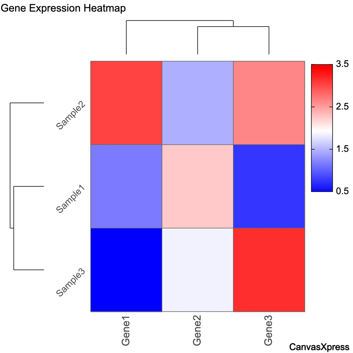
Creating Your First Heatmap
-
Prepare your data
Format your data as a matrix with rows representing variables (e.g., genes) and columns representing samples. Each cell contains a value (e.g., expression level).
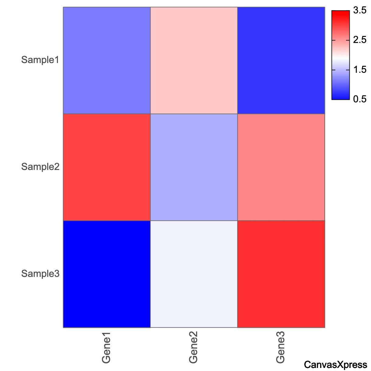
// Example data structure const data = [ ["Gene", "Gene1", "Gene2", "Gene3"], ["Sample1", 1.2, 2.3, 0.8], ["Sample2", 3.1, 1.5, 2.7], ["Sample3", 0.5, 1.9, 3.2] ]; -
Create a basic heatmap
Initialize CanvasXpress with your data and specify "Heatmap" as the graph type.
new CanvasXpress({
  renderTo: "canvasId",  // ID of the container element
  data: data,
  config: {
    graphType: "Heatmap",
    xAxis: ["Gene1", "Gene2", "Gene3"],
    colorSpectrum: ["blue", "white", "red"]
  }
});
-
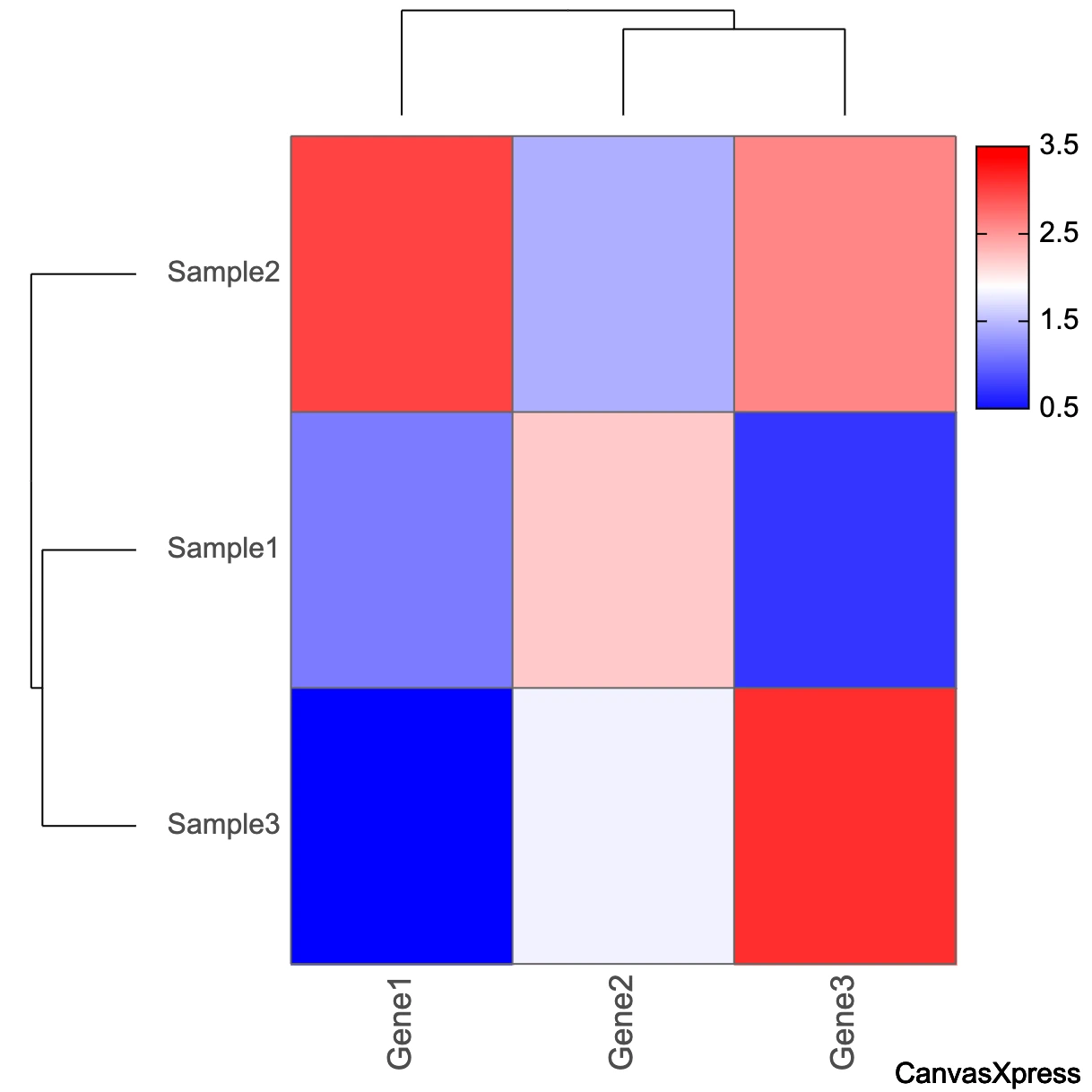
Add hierarchical clustering
Enable clustering to group similar samples and variables together.
new CanvasXpress({
  renderTo: "canvasId",  // ID of the container element
  data: data,
  config: {
    graphType: "Heatmap",
    xAxis: ["Gene1", "Gene2", "Gene3"],
    colorSpectrum: ["blue", "white", "red"],

    // Add clustering
    samplesClustered: true,
    variablesClustered: true,
    dendrogramSpace: 50
  }
});
-
Customize the appearance
Adjust colors, labels, and other visual elements to enhance readability.
new CanvasXpress({
  renderTo: "canvasId",  // ID of the container element
  data: data,
  config: {
    graphType: "Heatmap",
    xAxis: ["Gene1", "Gene2", "Gene3"],
    colorSpectrum: ["blue", "white", "red"],
    samplesClustered: true,
    variablesClustered: true,
    dendrogramSpace: 50,

    // Customizations
    title: "Gene Expression Heatmap",
    smpTextRotate: -45,
    heatmapIndicatorWidth: 300,
    heatmapIndicatorHeight: 50
  }
});
Library Comparison
See how CanvasXpress compares to other popular visualization libraries across key dimensions.
| Feature | CanvasXpress | D3.js | Plotly | Chart.js |
|---|---|---|---|---|
| Learning Curve | Moderate | Steep | Moderate | Gentle |
| Scientific Visualization Focus | High | Medium | Medium | Low |
| Built-in Graph Types | 40+ | Custom only | 40+ | 8 |
| R Integration | Native package | Via htmlwidgets | Native package | Limited |
| Python Integration | Native package | Via libraries | Native package | Limited |
| Large Dataset Performance | Excellent | Good | Good | Limited |
| Customization Flexibility | High | Very High | Medium | Medium |
| Cross-talk / Linked Plots | Built-in | Requires custom code | Requires custom code | Requires custom code |
| AI/LLM Integration | Built-in | None | None | None |
